- close
-
-
Collectionsarrow_drop_down
- All Collections
- Indienne
- Endpapers Wallcoverings
- Rare Textiles
- Domino Velvets
- Luxury Plains
- Moiré Wallcoverings
- Suffolk Damasks & Stripes
- Arcadian Thames Wallpapers
- Arcadian Thames Fabrics
- Arcadian Weaves
- Luxury Coordinates
- Cotswolds Manor Wallpapers
- Cotswolds Manor Fabrics
- Kensington Walk Wallpapers
- Kensington Walk Fabrics
-
Collectionsarrow_drop_down
A new, true light in the country
Pip Rich, Editor of LivingEtc, reflects on life in the country, his former hunger for city shades and how a rural outlook has shifted his perspective, with deep, meaningful moments of pause changing the way he designs within his home. A new light, both physically and metaphorically.
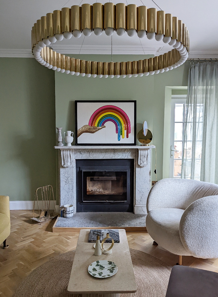
Picture white-green hues and soft grey, chalky walls, welcoming guests and willing them to stay, toes outstretched to the warmth from the marble fireplace, freshly baked goods and the genteel life of neighbour drop-ins and afternoons spent delicately teasing the branches of the orchard back into order. This idyllic life calls for a design and palette that adds to the serenity, calling guests to come and stay and inevitably shed a tear on leaving. Here, Zoffany’s True Matt Quarter Quartz Grey comes into its own, as Pip tells us…
“It’s a different kind of white that looks right in the countryside. A different kind of light to make it glow in a different way.
“Back home - well, my old home, the city - I liked bluey greys. Smart, cool shades that softened the tangy, citric glare of street lamps beaming in from outside, hues that spoke of Scandinavian dusks and dinner parties with invites that said any time from eight.
“Here, surrounded by fields and owls and neighbours that just turn up with a raspberry sponge, I like greens. The eye, it seems, can see more shades of green than any other colour, and I’d wager there’s a green-based white paint for each one. Verdantly tinged whites that speak of the orchard I don’t know how to care for just beyond the window, or olive greens the same colour as the bay tree in the garden, they work together to create an internal backdrop I never knew I needed, one that links me to my new surroundings in a way I never knew I craved.
“In our sitting room, with its original (to us, almost certainly not to the 1840s house) marble fireplace, I’ve chosen a soft, almost seafoam green for the walls which, when I’m sitting in it, reminds me of where I’ve moved to. Of why I moved here. It’s as peaceful as the life I was after.
“But back to the countryside light. You see, it picks up subtleties more clearly. Unfiltered by the shadows of nearby tower blocks it allows you to see the variations in pigments, the minuscule changes in texture. In our main guest bedroom, with windows on two sides, looking out onto a willow in one direction and a lawn in the other, I’ve used Zoffany’s True Matt Quarter Quartz Grey. Yes, I know, it’s grey, but some habits die hard, and it has a gentleness to it that reminds me of the silver birch outside. The finish is so perfectly powdery, so chalky that it shimmers, slightly, when the sun sets through the willow’s boughs. It has a quality I’ve not seen in paint before, a consistency so tactile it looks almost like linen. A suppleness I’d never expect. It does what I wanted it to for when guests come to stay. It makes them stop in the stillness of the room, take a moment’s pause, and relax.
“I think that’s the biggest difference between decorating for town and country. You create spaces to support the life you want to live, and the routine I have down here couldn't be further apart. The colours change because the moods you’re after have shifted too - back home (sorry, my old home), I needed to be charged up in the morning and wound down at night. Here, I drift soporifically from one moment to the next, the only stress coming from worrying if I’m caring for that orchard all wrong. And so, you can choose products and pieces and patterns and paints that have more delicate nuances within them, because you have more time to appreciate them, to be more fully aware. To notice how the light is shifting, and to shift your life within it.”
posted on 25 Feb 2022